Announcement
Collapse
No announcement yet.
Roadguide logo design
Collapse
This topic is closed.
X
X
-
hi nono,
i agree to this. simple na may dating...
we should have a simple logo that if one see it they already knew what that is. the more complicated the logo is, people will not notice.
logo is just a picture then you can put your text on the side of the logo.
just my 2 cents- Bruce LeeEmpty your mind, be formless. Shapeless, like water. If you put water into a cup, it becomes the cup. You put water into a bottle and it becomes the bottle. You put it in a teapot it becomes the teapot. Now, water can flow or it can crash. Be water my friend.
http://www.youtube.com/v/7m-SEdOKrE4...yer_detailpage
Comment
-
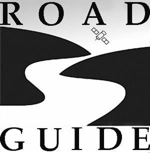
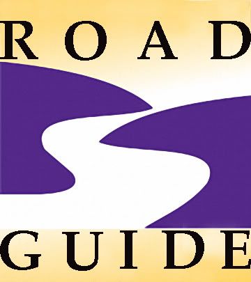
submitting a two color simple ROADGUIDE logo:
1. blue - letter "r"; ROAD; main focus of the logo
2. red - letter "G"; GUIDE; leaf shaped means growth
3. combined blue and red - ROAD with white dotted lines as two directional lanes; upper color is blue while lower is red representing color of philippine flag
4. blue arrow pointing up (got the idea from the triangular blue shaped in Garmin logo tho its optional, can be removed it not applicable)
5. I can extend the tail of letter "G" below if needed and make it appear small letter "g" yet i prefer this one.
6. overall shape of road or street is derived from the directional sign when driving using GPS where the instruction is, "turn right". Direction to right since its positive (as opposed to "turn left") making it very ideal to form letter "r".
7. i can change the color depending on your suggestion
thanks for the opportunity to present my idea for the ROADGUIDE logo!

Comment
-
can you modify the road so it ends in an arrow? if you get my drift...Originally posted by amf View PostFor those who want it plain and simple and won't alter the looks of you rides

Comment


 Questions? Check Out The:


 \
\

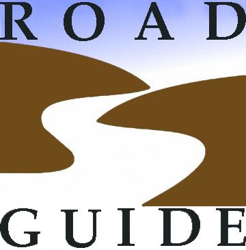



Comment